Saturday, 29 September 2012

Research and Planning - Alex Hardisty CV

Alexander Hardisty Actors CV


As promised, Alex sent me his extensive actors CV (a requirement in the auditioning process to ensure the acting quality in the trailer is of a good standard and to avoid having to spend hours getting one scene right due to an actors poor ability)

ACTING CV

 Alexander Darren Arthur Hardisty

Gorse Hall Productions:

 Oliver Twist - Bill Sykes
Christmas Nativity - Joseph
Grease - Danny Zuko
Wizard of Oz - Scarecrow
Frankenstein - Police Man 2

Copley College Productions:

Les Miserables - Enjolras 
Interview with a Vampire - Vampire Slayer
Dracula - Policeman
French Revolution Living History - Prisoner
Romeo and Juliet - House of Capulet (Extra)
Men in Black - Agent Z

Royal Northern College of Music

Pirates of Penzance - Young Fredrick 
Yeoman Of The Guard - Colonel Fairfax
Patience - Army Cavalrymen Singer

Other Theatre Credits Include:

 Peter Pan - Smee
Shakespeare In Love - Shakespeare (Younger)
My Fair Lady - Professor Higgins
Charlie and the Chocolate Factory - Grandpa Joe
The Phantom of The Opera - The Phantom

Friday, 28 September 2012

Research and Planning - What is a Trailer?

A trailer/teaser trailer is what is typically used as a brief preview of a new film. It shows snippets of the over all movie to gain audience interest and promote the film, as well as inform the audience of the name of the film and release date. Most trailers typically contain the same key elements.

A trailer/teaser trailer typically includes the key elements listed below:

A montage - A selection of out of order scenes and clips edited together to create a sequence which gives the audience an over view of what to expect from the film as a whole.

Peaks - High points of action from the complete film which entice the audience into wanting to watch the over all film.

A voice-over - Speech over the top of the video clips in the trailer to help tell the narrative and make the film sound interesting and appealing to the audience.

Titles - Words in-between clips, or over the top of clips, which do the same as a voice over but are visual rather than auditory.

The title of film - The title of the over all motion picture the trailer is for should be included to let the audience know what the trailer is actually advertising.

A release date - A date the film will be released into the cinema, so the audience know when they can view it.

Certificate - Usually found before the trailer begins, a certificate gives an age appropriate rating for both the trailer and the film to ensure it is only seen by a suitable audience.

Studio name - The name of the studio/production company which has created the film is always found in a trailer and teaser trailer also.

Research and Planning - Questionnaire results

After receiving all 9 questionnaires back, myself and my partner collated the results in the form of a Powerpoint containing both graphs/charts and bullet point answers.

Results:

What age are you?


This shows that my audience is primarily going to be between 16 and 18, meaning the trailer will have to be suitable for these ages.

What is your gender?


There were more female responses than male, suggesting that within our sample our audience is more female and we should take that into consideration when making the trailer (for example: having an attractive male lead)

Which movie genres do you like?


Horror, thriller and action take up the three largest sections of this chart, meaning an amalgamation of all three with a predominantly horror feel is what will really appeal to our audience.

Would you prefer titles or a voiceover?


Our sample seems to much prefer Titles to a voiceover and so titles will be used in the trailer.

What music would you prefer?


Low and deep music seems to be the favourite out of all these options, suggesting that it should be the predominant style of sound/music in the trailer.

What musical instruments do you expect to hear in the soundtrack?


The instruments listed above appeared in one or more questionnaire and will be used in the trailer as a result.

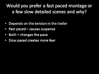
Would you prefer a fast paced montage, or a few slow detailed scenes and why?


The results were fairly mixed on this question, but all responses stated that the tension in the trailer was key to the trailers success, the speed of the editing/length of clips isn't as important as long as tension is created throughout.

Which colours would you associate with horror?


Black, red and white were the three colours most associated with horror - I will take this into consideration when planning the mise-en-scene for the trailer.

Would you prefer the lead character to be male or female?


The over all view is that the main character should be male, this really helps decide the plot for me and my media partner as we weren't sure which idea to go for, one where the lead is female and one where the lead is male.

Would you prefer close-ups to show panic, or master shots to show the over all scene?


I will take this into consideration when planning my cinematography for the trailer.

Would you prefer to watch a film created on a handheld camera, or on a tripod?


My personal opinion goes strongly against these results, however if this is what a sample of my audience prefers, then I will take that into consideration.

Research and Planning - Questionnaire

Me and my partner created a questionnaire containing 8 questions related to the editing, cinematography, mise-en-scene and sound of our horror movie. The questionnaire also asked the age and gender of the people filling out the questionnaires to help establish our target audience. We sent out 9 questionnaires in total.

The Questionnaire:


The Questionnaire filled in:


Thursday, 27 September 2012

Research and Planning - Actor: Alex Hardisty

Alexander Hardisty
Friend and amateur/semi-professional musical theatre actor Alexander Hardisty has shown an interest in being part of my horror movie trailer. Although Alex is more used to treading the boards than being on film I believe his capabilities as an actor will allow for an easy and smooth transition from the stage to the screen. Alex is exceptionally good at taking direction and although he's a little dissappointed he won't get to show off his vocal abilities, he is excited to be potentially part of a horror movie trailer created by myself and my media partner.
Alexander was the first person to reply to my appeal on Twitter for people to audition in my horror movie trailer. His Twitter Biography alone makes me believe he is more than suitable to be cast in the trailer!

Alexander will still have to go through the auditioning process the same as everyother applicant, however he seems a very promising actor to have found at such an early stage of the audition process! He has assured me he will email me his acting CV over the next few days so I can review his previous acting work, to which there is an extensive list I have been told!
As well as being a promising actor, Alex also has a suitable look for the role myself and my partner have in mind for him. He is also of the right age to appeal to the film trailers target audience.


Research and Planning - Twitter: Audition Process


Today I put out a public tweet on Twitter to over 300 followers, asking if anyone would be interested in auditioning for my horror movie trailer. This is the first step in getting the word out there about the auditioning process and I aim to also make posters to put up around College, create a Facebook status about it and hopefully have my media partner do the same, in order to get as many auditionees as possible!

Due to our extensive auditioning process I believe it's necessary to start advertising the auditions this early in the process - I like to be incredibly organised in order to avoid failure!

Research and Planning - Group Meeting


After having a discussion about how to appropriately cast the characters and extras required for our teaser trailer we began to devise an audition process where I would take headshots of all the people who turn up to audition - for both future reference and to make sure they have the right look for the genre and idea we have in mind. We will then request a computer processed acting CV containing as little or as much acting experience as they have. Although we know we are unlikely to get professional actors in our trailer, we want to ensure that the quality of the acting is of a high standard - the acting should definitely not be the area of the trailer which looks unprofessional. We will set a deadline for applicants and once that deadline is reached we will decide who both looks suitable for the trailer and has a good amount of experience, then the audition process will begin.

It has been decided that one of the most difficult and ambitions scenes we are going to undertake is a mirror shot in a bathroom where a supernatural prescence keeps appearing and dissappearing whilst the main character is splashing their face with water, then looking into the mirror and screaming at the site of their 'changed' and more zombified face after having contact with the supernatural prescence stalking them. As this is going to be one of the key tension building scenes, which also makes the audience jump, it has to be executed precisely by both the camera operator (myself) and the actors involved. If an actor is capable of successfully acting in this, the most complex scene, then they will be suitable for the rest of the trailer, however if they can't execute this scene well enough, then there is no point them being cast at all, even if they excel in all other scenes in the trailer. Every audition will be videod as if it was the real final take of the scene for the real trailer and each person will get one runthrough attempt and then two proper video attempts which will be compared with the other applicants to find who is the most suitable for the trailer.

This auditioning process may seem a little 'over the top' for an amateur horror movie trailer, however myself and my partner are passionate about our media work and want to create a trailer which looks as professional as possible.

Wednesday, 26 September 2012

Research and Planning - Target Audience Top 40

The target audience age for my horror movie is going to be between 18 and 21, the typical student age, so I conducted some research into that age categories favourite movies of all time (as shown below):


The horror genre doesn't seem to feature very strongly at all within the top 40 films my target audience most likes. However, by ratio, there have been less horror movies in the cinemas over the years in comparison to fantasy and action films, which feature more prominently in the top 40 list above, making this list slightly unfair on films of the horror genre.

Research and Planning - Most popular horror films

The top 5 horror films of all time are shown in the screenshot above. I can now look at the trailers and plotlines for these films in an attempt to inspire my own trailer.


Research and Planning - Target Audience Prezi

">

Monday, 24 September 2012

Research and Planning - Audience Theories

Hypodermic needle theory


This theory suggests the messages of the film go directly into the audience's brain.

Cultivation theory


High exposure to television causes a change in viewers perception of reality.

Desensitisation


The more a person is exposed to something, the less sensitive they become to it.

Modelling or copycat theory


The actions in the film/game will be copied by the audience.

Uses and gratifications

Users search for specific media outlets for gratification. For example: searching for social media to prevent loneliness.

Friday, 21 September 2012

Research and Planning - Group Meeting


I had the first meeting with my partner today to discuss who was going to take on which role during the filming and production of our horror film teaser trailer. It was decided that I would take on the responsibilities of Cinematography and Mise-en-scene and my partner Danny would be responsible for Editing and Sound. It was decided that I would do the Cinematography and Mise-en-scene as I am particularly good at visualising, creating and then capturing exactly what I imagine in my mind. Danny is taking on Editing and Sound as he is particularly good at using computer software and has a keener eye and ear when it comes to editing and sound than I do!

Research and Planning - Analysis 2

Analysis 2


GENRE

 The genre of this film trailer is horror, with a little bit of action thrown in. I can tell this trailer is of the horror genre due to the captions saying "what scares you most?" implying the film is going to be about fears and of a scary horror nature. This trailer fits with Carol Glover's theory that the final girl will be terrorised throughout the film, as the main character throughout the trailer, shown at the beginning, middle and end, is a girl who seems to be being terrorised by the monster in the film. This shows the trailer is of a horror nature, as this theory primarily applies to the horror genre. Andrew Sarris' theory that "genre is the idea that it has a recognisable style that draws on an existing audience" is also true of this trailer, as it has a recognisable horror style shown through the captions, lighting and over all clips in the trailer, which will draw on an existing audience, as it was created by the makers of Aliens and Terminator 2 and has a similar style to them whilst adding a larger element of horror to it.

REPRESENTATION

 I don't particularly believe that this trailer is shown through Laura Mulvey's suggested "Male gaze" as the hero of the trailer and main character is a strong independent and intelligent woman (shown through her being a computer scientist at the beginning and running away from fire at the end) who is not at all objectified. It shows the men to be the vulnerable ones, as they are the ones who fall victim to the monster in the trailer. Age is represented through the old woman worrying about the museum rather than trying to help fight the monster, suggesting a stereotype that all old women do is moan and complain. Although I believe this trailer breaks a lot of gender stereotypes through the things I've mentioned above, it also conforms to the stereotype of Police being a male profession, as all the police shown in the trailer are male.

NARRATIVE

The narrative is ultimately about the mutation of a human explorer who has become a monster who feeds on the hypothalmus of the human brain and is being kept in a storage box below the museum. He wakes up on the night of the human phobeas exhibition and tries to murderer everyone in the most grusome ways possible. The narative is shown through the selection of shots and scenes throughout the trailer, starting the in museum, then the science lab and working cronologically through the movie, giving the audience an impression of the narrative. The titles help to tell the narative a little, inferring it is about a persons biggest fear, as the titles read "what scares you most?". The narrative is also shown briefly through the short montage of clips in the trailer.

AUDIENCE

The trailer of the film has been approved as appropriate for all audiences, so anyone could potentially have viewed this film trailer on tv and at the start of other films they have gone to see at the cinema. Taking into account the overall movie was rated 'R' (where an under 17 is required to be with a concenting adult to view the movie), I believe the target audience would be 18 to 21 year old males, as steroetypically it is student aged males who predominantly enjoy the horror genre of film. The audience needs to be very active whilst watching the film as some of the psychological fear is locked behind an intricate plot and only if you follow and understand the plot does the film appear to get scarier - this suggests to be that it would be College and University students who are the audience of this film, as if they are intelligent enough to have progressed to College and University, then they are intelligent enough to be able to follow the plotline and work out some of the complex psychologically scaring parts of the film.

MEDIA LANGUAGE

Cinematography

Close ups of characters and zooms used to show facial expressions of realisation, shock and fear, instilling those emotions into the audience too. The mastershot of the Museum at the beginning sets the theme and tone for the entire trailer and film, as the audience now know where the trailer/film is set and the oldness of a museum (along with all the rare and often creepy artifacts) create anticipation and tension within the audience as their minds put forward possible plotlines the movie could follow. The camera pans on the inside of the museum also help to set the scene and re-affirm the location of the film. High angles are used to represent the weakness of the human race in comparison with the creature that is trying to attack them.
 
Editing

Fast straight cuts are used in conjuction with a montage to give a feel for the film to audience and also build suspense and anticipation within the trailer. Camera flashes are used as transitions within this trailer. Ttiles are also added to cause psychological fear to the audience as they ask "What scares you most?" making the audience think of their biggest primal fear and then associating that to the film, causing an increase in fear and tension. During the clips fading in and out of black the deigetic sound of the characters breath can be heard in time with the fades, adding suspense and tention to the trailer.

Sound

The eerie sounding non-deigetic music played over the opening of the trailer really sets the horror mood, immediately building suspense and tention. the diegetic sounds of lights suddenly shutting off along with screams from characters shown in the clips has the intention of making the audience jump and induce fear, as its of the horror genre.

Mise-en-scene

The museum and laboratory settings in the low key lighting looks eerie and immediately sets the scene for some sort of historical experiment to go wrong, or something hidden in the museum to wake up and be the key element in the horror movie - causing suspense as the audience think theyve worked out what is going to happen from the setting and now they are waiting tensely to see if they are correct. The big glasses worn by the female character represent her innocence and 'wide eyed' view of the world which is shattered when the moster begins to attack the museum she works in, as the trailer and movie progress her glasses are broken and removed, representing the change in the character and pivotal points in the film.

Wednesday, 19 September 2012

Research and Planning - Facebook feedback


I asked my friends on Facebook to give me some advice on which horror film trailer I should analyse.

Research and Planning - Teaser Trailer Poll

This poll containing 5 questions was created to help me understand what people want from a horror movie, so I can create a good horror teaser trailer.

For some reason poll-junkie has deleted my poll - but here is a link to a blog post containing the poll results: http://beckymckenziea2.blogspot.co.uk/2013/01/research-and-planning-poll-results.html 

Monday, 17 September 2012

Research and Planning - Analysis 1

Analysis 1


Repo! The Genetic Opera


GENRE

This movie trailer is for the genre of horror. The genre of horror is shown in this movie trailer in many different ways, from the costumes and locations, to the colours and over all character appearances. The costumes portray the horror genre as they are primarily gothic and made from black leather, which is associated with evil and villains which are typical of horror films. The colours of rich reds, contrasted with the blacks, gives the appearance of horror, as the colour red is associated with blood and danger and black is associated with the unknown and evil, typical features of the horror genre. The locations shown in the trailer range from a dark gothic building, to a graveyard and a torture room - locations typically associated with the horror genre, as they have elements of fear and danger about them. The characters that are featured in this trailer also give the impression that the genre of the film is horror, as two of the characters are seen clipping/gluing on human faces which is quite horrifying. This trailer also complies with Carol Glover's theory about the final girl being terrorised throughout the film, as the young female character in the trailer appears all the way through the trailer as the central character who is left alive at the end. That theory is usually applicable to horror movies only, making it clear that this movie trailer is of the horror genre. Levi Strauss and Roland Barthes theory of binary opposites is also featured in this trailer, as we see a young vulnerable female character along with a strong elderly male character killing people, which appear to be binary opposites.

REPRESENTATION

Laura Mulvey put forward the theory of 'the male gaze' suggesting everything is seen through a male perspective and I believe that to be true in this trailer. I believe it to be true as all the women in the trailer appear to be objectified and sexualised; wearing revealing clothing and having 'perfect' bodies which the typical male would find pleasing. The gender representations seem very stereotypical, as the women are objectified, sexualised and seem to be the vulnerable ones in the trailer, as they are dressed provocatively and are seen either being sexual, screaming, or looking scared throughout the trailer. In contrast the men are shown as strong, aggressive and dominant as they are the ones killing people, fighting and being fussed over by the women. Age is also stereotyped, as the elderly male figure in the trailer seems the most powerful, whilst the young female seems the most weak and vulnerable.

NARRATIVE

The story of the film is about a company named 'Gene Co.' selling replacement organs to humans on Earth after mass organ failure had become common in the future. However if the people can't keep up with their payments for their organs, then Gene Co's repo man comes and takes them back. The Repo man is also leading a double life as a monstrous legal assassin and a sick girl's loving father. This narrative is shown in the trailer through a few different methods, the first of which is the voiceover which begins to tell the story before the music from the film takes over. The second method is the rather unconventional comic strip featured in the beginning of the trailer to attempt to tell the opening of the plot line to the audience. The narrative is also shown through montages, particularly the montage of the same character flicking from one persona to the other, showing the narrative of him having a double life.

AUDIENCE

The audience of this trailer is anyone who happens to see it on TV or at the beginning of another film they are watching, however keeping in mind the movie is age rated 18, I believe the audience will be people over the age of 18. However, I believe the primary audience that this movie was targeted at was 18 to 25 year old males, who like rock music and comic books. I believe the target age was 18 to 25 because the creator of the movie, who also stars in it, is Terrance Zdunich - a Canadian Comic Book artist and musical theatre star, whose main fanbase is between the age of 18 and 25. I believe the main audience gender would be male, as the female characters are very objectified and sexualised, appealing primarily to males. As the music in the movie and the trailer is rock style, I believe the target audience would be interested rock music, as well as musical theatre as the 'big name stars' in the movie are all associated with musical theatre (Terrance Zdunich, Sarah Brightman and Anthony Head). I also believe the target audience would include students, as it has a very comic book feel to it and stereotypically it is students which love comic books and movie comic book adaptations. The audience need to be quite 'active' to understand the plotline, even though the trailer makes the movie look straight forward and not require much concentration.

MEDIA LANGUAGE 

Cinematography

Close ups are used a lot in this trailer to convey the emotions of the characters and show their fear and horror, or similar emotions, to add an element of horror to the trailer. Over the shoulder shots are used so that the audience of the trailer can see something that the character they're looking over the shoulder of can't, increasing the tension. High angles are used on the vulnerable characters and low angles are used on the powerful characters, to show who are going to be the main characters in the movie. The shots are kept at eyelevel with the young girl character, signifying that she is the one the audience will watch the movie and become most attached to and see the movie through her perspective. There are zooms in the trailer to show the emotion and realisation of things by the characters, heightening the tension.

Editing

Jump cuts are used in the trailer to give the impression of something being wrong and increasing te tension for the audience. Fast straight cuts are also used to give the impression of panic and add to the horror genre of the trailer. Titles are used in between the montages of clips to add suspense to the trailer and help tell the story through the trailer. Montages are used to show the equilibrium and disruption that takes place throughout the movie, as well as showcasing the characters and showing the audience a little of what they will see in the complete film.

Sound

The voice over at the beginning is a deep male voice, which sounds very fitting with the horror genre and helps to set the over all scene and tell the story of the film. The diegetic sound switches to non-diegetic and back again throughout the trailer, as the film is a musical and the music that is played by the band and sang by the characters (making it diegetic), is also played over a montage of clips where the music becomes non-diegetic. The music which is both diegetic and non-diegetic has a rock hint to it and also has quite a horror element to it too regarding the lyrics and the baselines.

Mise-en-scene

The clothing of all the characters are rather gothic and black, adding an eerie and element to the film purely through costumes. Most of the shots are in low-key lighting, associated with horror, to show the dark nature of the film. The locations shown in the trailer, such as the big gothic house, torture rooms and graveyard are all places typically associated with horror, which cause tension in the audience.

Sunday, 16 September 2012

Research and Planning - Audience interviews

Audience Interviews


Main Interview Findings:

After interviewing three people from three different age categories (under 18, over 18 and over 40s) I am very pleased to say the results of the interviews seem to indicate that my horror film trailer plot idea is on the right track for pleasing all types of audiences! It contains the main features of suspense, tension and psychologically thrilling moments in it, which seem to be the things the people I interviewed liked about horror films the best. I'm going to carefully go over my plot-line idea again and use the feedback from these interviews to make it better!

Saturday, 15 September 2012

Research and Planning - Interview Questions

These are the questions I asked the people I interviewed in order to get a better understanding of what I should include in my horror movie trailer:

-Do you like horror films? If yes, which is your favourite and why?
-Would you watch a horror about a man fixated on a woman and why?
-Would a film appeal to you if it had a super natural content? Why?
-What specifically do you like about the horror genre?
-What do you dislike about the horror genre?
-What do you typically associate with the horror genre?
-What would you expect from an 18 rated film?
-What locations do you associate with horror?

Friday, 14 September 2012

Research and Planning - Regulation and Censorship


 For the purposes of being able to have the trailer shown on television and in the cinemas, the certificate of the movie trailer should be a 15 at the most, as any higher and the places my movie trailer can be shown and publicised in will become limited. Also, the scenes of the film that will move the rating up to an 18 for the actual movie should be kept from public view until they see the film in order to preserve its shock and horror factor, making certificate 15 appropriate for the movie trailer.


The actual film its self should be rated an 18 purely for caution. The plot-line of the film lends its self to a more mature audience who will not be as psychologically damaged or affected by the horror and paranormal nature of the film. Similar films to my film idea have been rated at certificate 18 also, making me believe my film would be unsuitable for younger audiences and should be rated an 18 certificate.

Research and Planning - Photoshop Challenge


The Photoshop challenge required me to create a movie poster for a specific genre on photoshop within an hour. The genre I chose was horror. Repo the Genetic Opera a particular favourite horror movie of mine and so I used a promotional image from that movie as the background of my horror movie poster. I darkened the image slightly to make the blue tint stand out more and then added text over the top of the image. I embossed the text, added a drop shadow and a grey gradient to the text to give the effect of the text being metal. I added the features of a title, release date, website address, facebook icon, reviews, slugline and production credits to the poster.

Research and Planning - The Pitch


The URL is below in case the embed link doesn't work:

http://www.slideshare.net/rebeccakmckenzie/pitch-14291240

Monday, 10 September 2012

Research and Planning - The Chase


This was my first attempt at video recording, editing and adding music to a sequence in a group. For a first attempt I don't think it's half bad! I'm quite happy with the way the editing was done, as the straight cuts and transitions seem to be quite smooth and clean compared to how I imagined my first attempt at editing to look. I'm quite proud of how the different camera angles were cut together in the scene where I was putting my bag on, as it makes the scene more interesting and demonstrates the group's creative editing abilities at such an early stage. I'm not particularly pleased with the sound on this video, as although the music fits the running sequence and fits the title of "The Chase" it doesn't particularly fit the ending where the slow motion effect has been applied along with the heartbeat sound. I hope to learn from this first attempt and apply the knowledge and techniques I'm already aware of to any future attempts.

If I was to do this task again and have longer to do it, I would ensure the camera was on a tripod so the camera movement was smoother and steadier, giving a more professional look. If I'd had more time I would have marked certain spots on the floor with tape to use a specific marks to hit whilst running/acting in the scenes to improve continuity through the different takes/angles of the same action/movement. As for mise-en-scene, seeing as the plot-line idea was a college student running out of their house to get to college because they were late and then being followed by another creepy stalker type student, the clothing worn in the video was suitable and so were the locations that were used. Personally, I would have liked to have spent longer searching for, or composing/recording, the background music on the video, as I think it is the biggest area that let the video down.

Overall I'm rather pleased with this first attempt!!