The most eye catching cover lines on this Total Film magazine cover are located centralised in the bottom half of the cover. I believed they are only located there due to the dark colour of the character/actor's suit/costume being a suitable background.
The cover lines themselves are similar to what I have already considered having on my cover, such as polls and countdowns of things such as 'the 27 most mind-blowing movies ever' and interviews like the one inferred by the cover line 'meet the master of mind flicks'
The main eye-catching cover lines on this Total Film magazine cover are situated on either side of the bottom half of the cover. The cover lines themselves are similar to what I have already thought of using on my own cover, such as film star news/gossip like 'Matt Damon mouths off' and interviews/reviews such as 'Tron 2, Jeff Bridges on the 'astounding' sequel'.

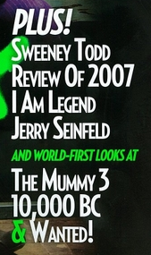
The main eye-catching cover lines on this Empire magazine are located on the right hand side of the bottom half of the cover. The cover lines include content about new films such as 'Sweeny Todd' - I hope to have similar cover lines about new films such as 'Les Miserable'.
From looking at these three magazines which are suitable for my horror film to be promoted in, I now realise that the majority of the cover lines (or the most eye catching ones at least) are placed in the bottom half of the cover and usually down the sides. This has helped me to understand where to best place my cover lines and has also confirmed to me that the cover line ideas I have are suitable for and typical of a film magazine.


No comments:
Post a Comment